Open Sangha Foundation · design prototypes · 14 November 2026

Three ways the same site could look

Each direction is a home page, a working Find page and a page that lays out its design language. They share the same words and the same 150 real public listings. Nothing here has accounts or sends anything.
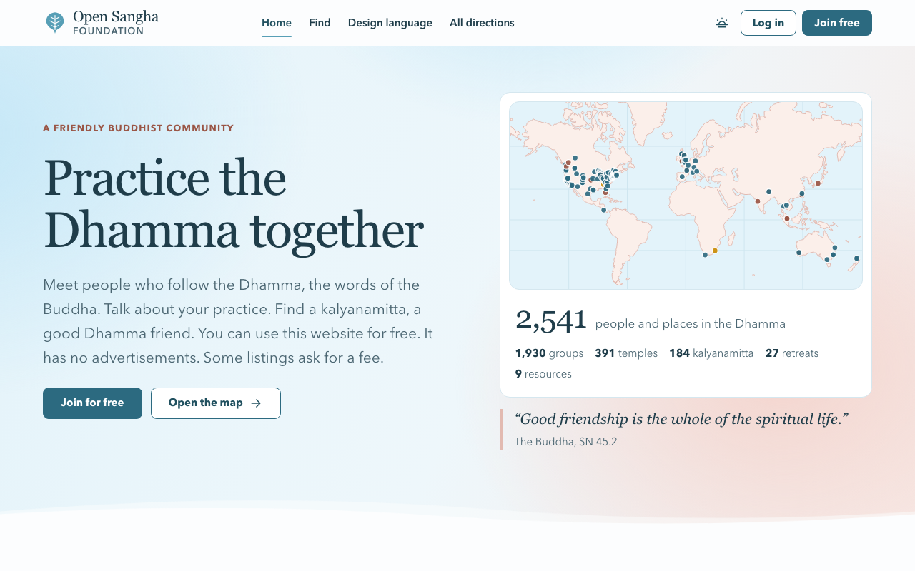
Shore home page: pale blue to pink wash, serif headline, a map card.

Shore

The look the current rebuild is reaching for, done as one system. Beach wash, deep teal, terracotta labels, a designed dusk.

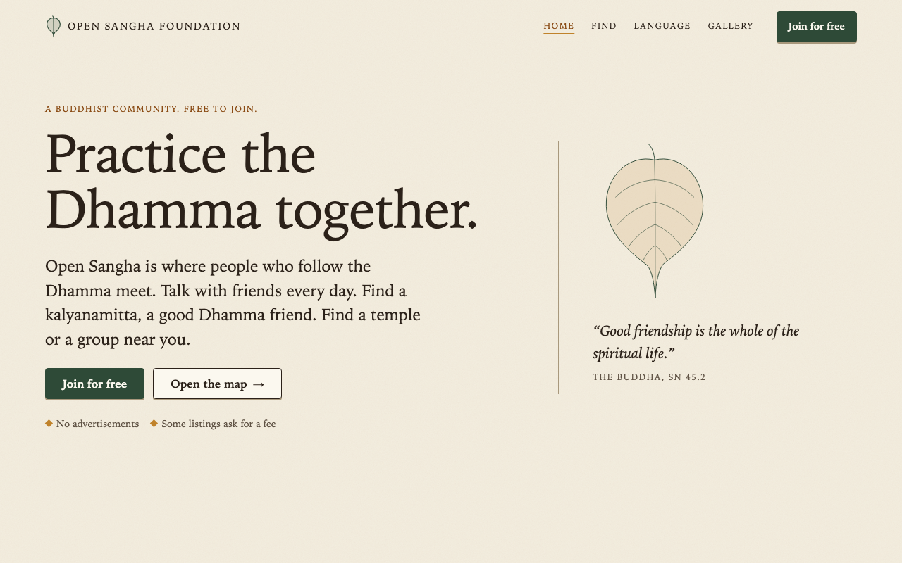
Wat home page: warm paper, bookish serif, a drawn leaf, hairline rules.

Wat

A forest monastery's quiet, in print. Warm paper and ink, one serif, index-card listings and an engraved chart for a map.

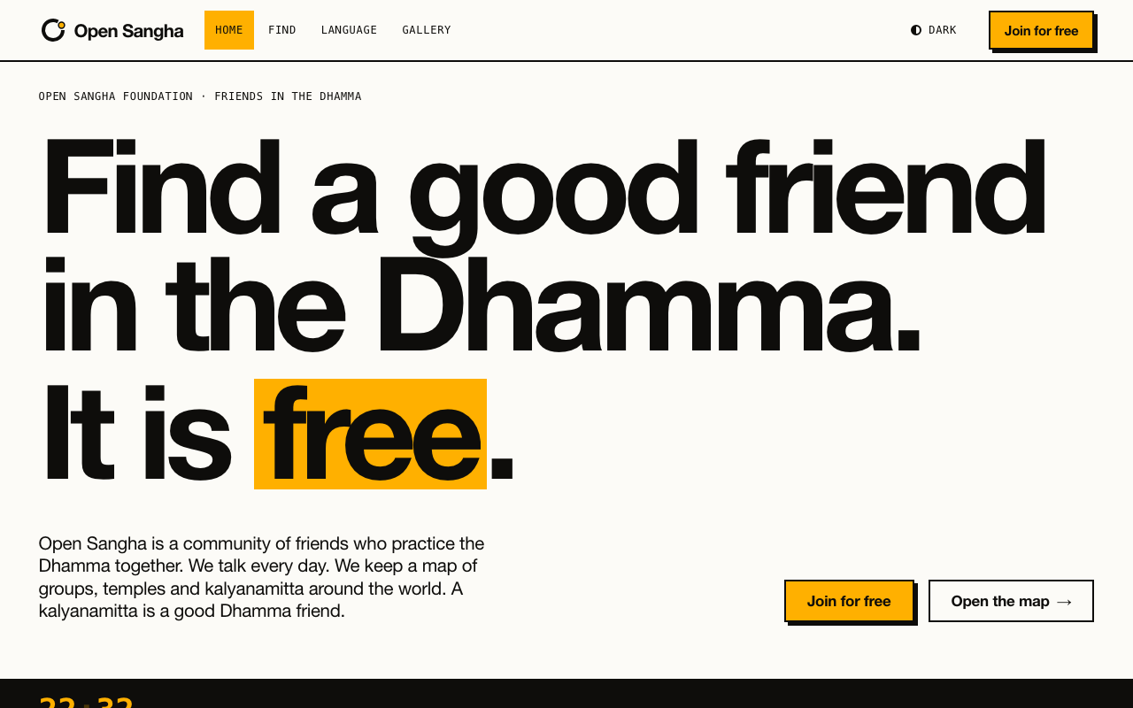
Open Hand home page: huge black type on paper with one marigold highlight.

Open Hand

No beating around the bush, taken literally. Ink on paper, very large type, honest numbers and one marigold highlighter.